 Hi!
Hi!
So I wanted to show you a little more of the “behind the scenes” from the music video for one of my songs, “No te necesito”, that we recorded some time ago. The video is in the final stages of post production and I should be getting the final copy soon. Yay! In the meantime, I wanted to share with you the good and the bad of the transformation of the space. I will always be honest here and part of that is accepting your mistakes and showing you that I’m human too.
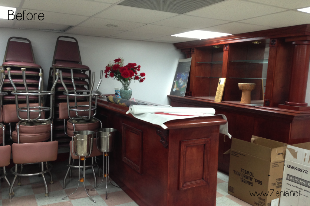
Like I mention in the first blog post about this music video, I didn’t want to spend a lot of money on it, since the purpose of this video is just to have fun and promote my music using visuals. That said, the space used to be a green room where artists would hang out while they waited to perform their music in the CD store below. (Yes, there is still a store selling CDs in Miami. It’s called “El Museo del Disco”).
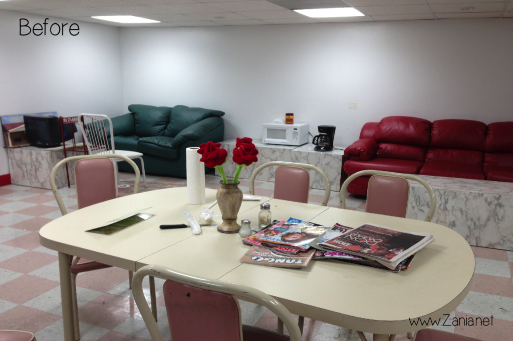
Here are the Before pictures of the bar and stage (respectively);

 I mean… seriously… neglected. But it was free and we were able to pretty much do whatever we wanted, for however long we needed, for FREE. Free sounds good to me.
I was inspired to create an “underground” lounge/bar scene where an audience would go to watch a multitude of amateur talent on open mic nights. I think I did an ok job given the tight budget and the resources, but looking back, there are several things I would change.
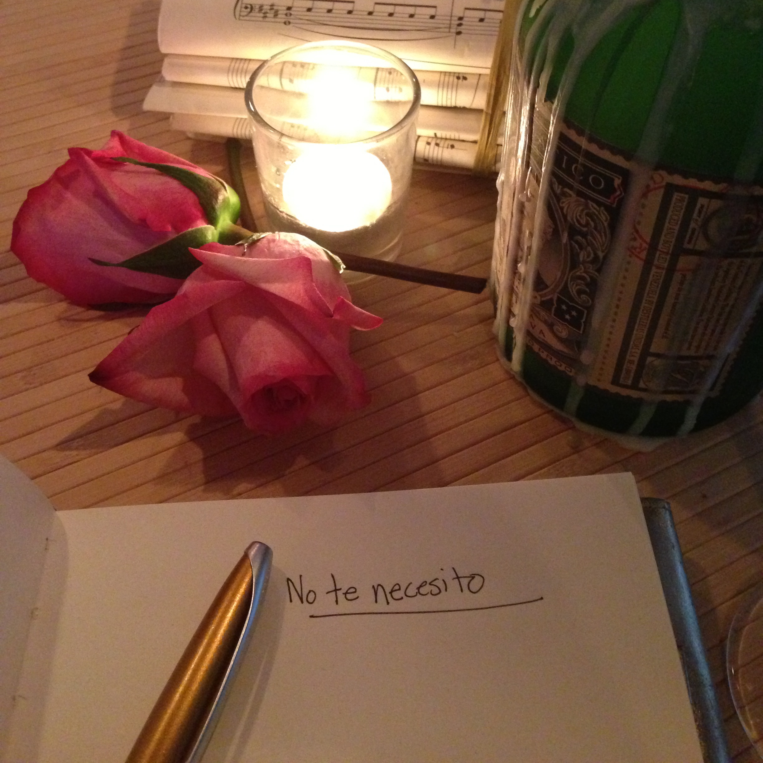
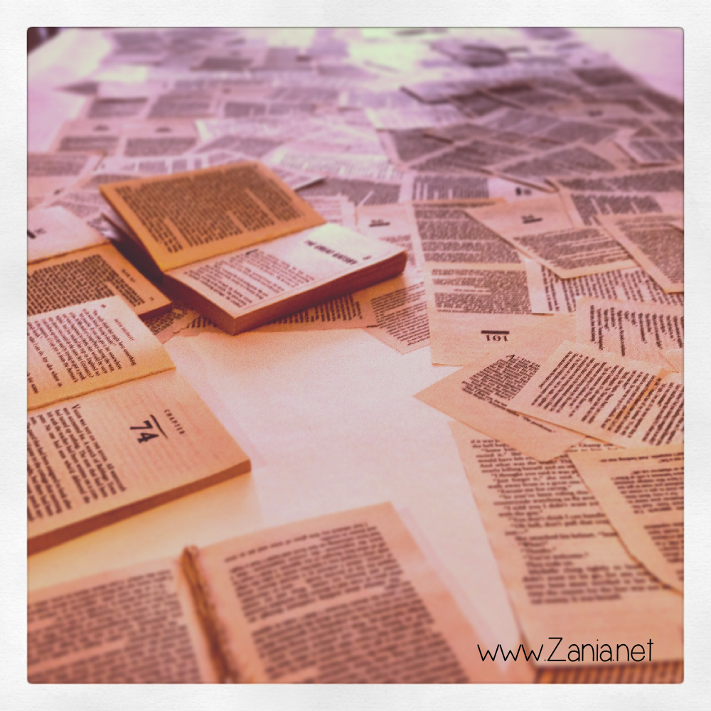
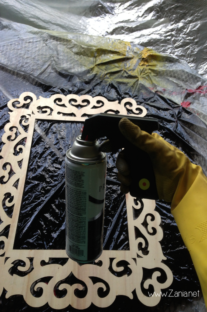
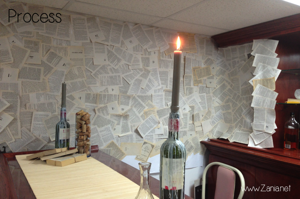
First, I spent a lot of time planning. Lists and lists of things to do, as well as what to take to the set. The list was enormous. Get ottomans from friend… spray paint wooden frames… clean wine bottles… melt wax on them to give them an old world looky look… spray adhesive to each and every book page… (I had Oprah’s Masterclass playing for audio entertainment. Multitasking)… It was a lot, but it got done with time to spare. These are the pics I posted on Instagram.

 Then it was time to set up. Princess Prius (my car) was completely filled with furniture and stuff, to the point that the guard from my building asked me if I had scheduled a moving-out date on the calendar… LOL! No, sir. But BTW, I’m doing this again in a week to get everything back home. See ya!
Then it was time to set up. Like the Tr3s Top 20 set I previously designed, decorating a set is very different than a residential room. I wrote about those differences HERE. I was confident with my design idea because it was clear and precise, but I couldn’t help but doubt myself every now and then.

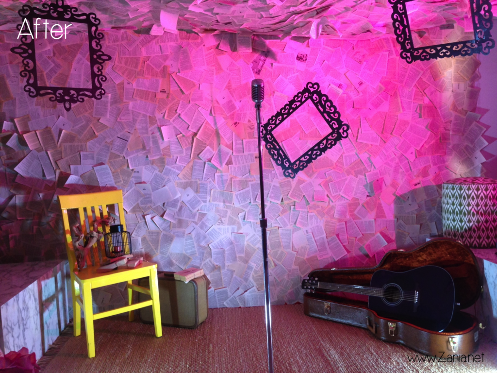
 Now that I see the set, I think the bar area was better designed than the stage. I love the paper walls and the natural fiber rug, but the chair and the ottomans were too modern/bright for the space. The purpose of the chair was to add color, but it didn’t quite go with the design. I do like the vintage suitcase and the open guitar case. Those white boxes on the side needed to be covered in black or something, because they are very ugly. But hey, you live and you learn. Overall I think I did an ok job. Next time it’ll be better.
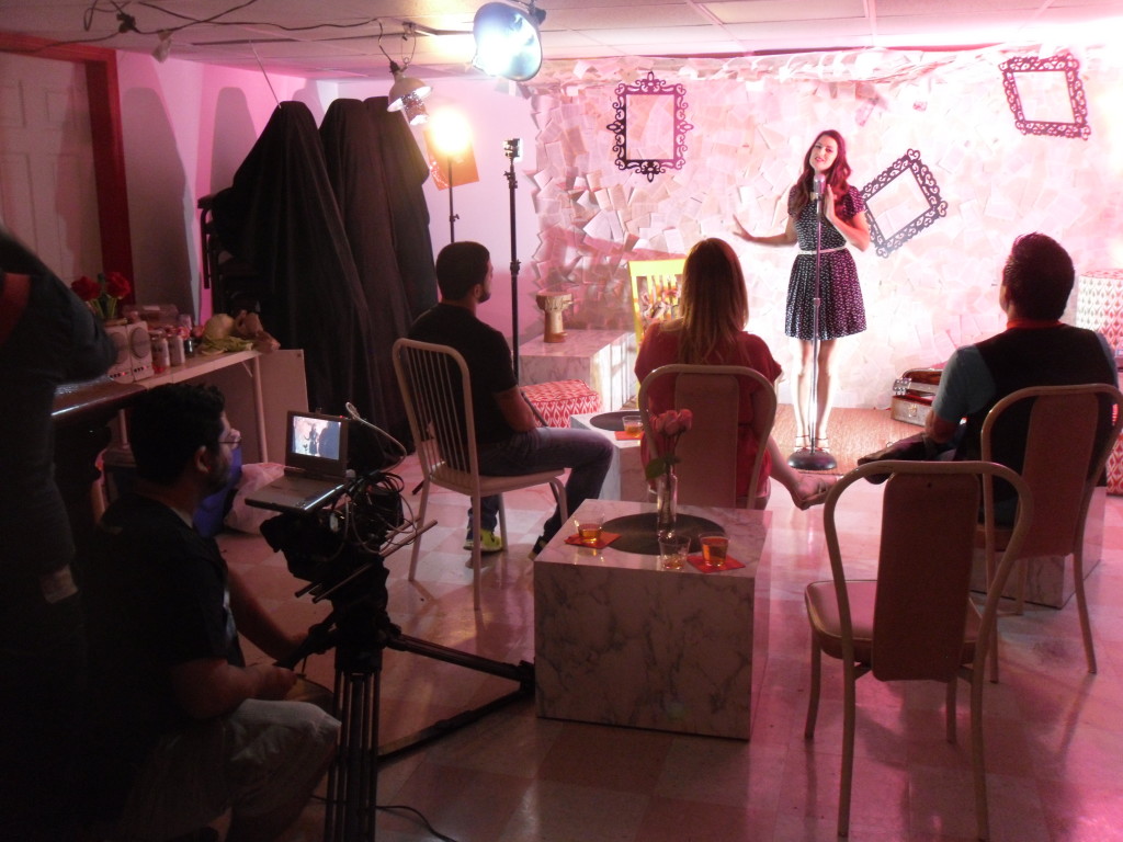
This was taken during the recording of the video.

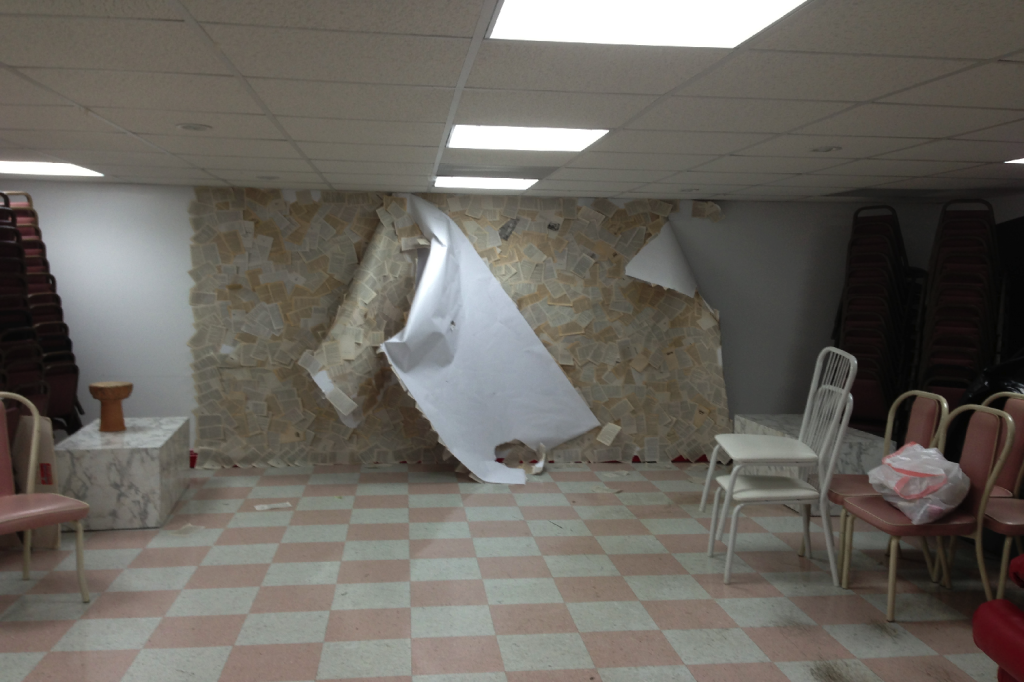
 Then after all that work… it gets torn down in a second. Oh well. You’ll get to see the final product once the video is released. Stay tuned! I will be posting the video on YouTube and on all social media sites as well as here.
Thanks for reading!


